Stanford University
Stanford University Graduate School of Business’ recruiting team tasked us with creating an unconventional website to help them attract incoming students who thought outside of the box.
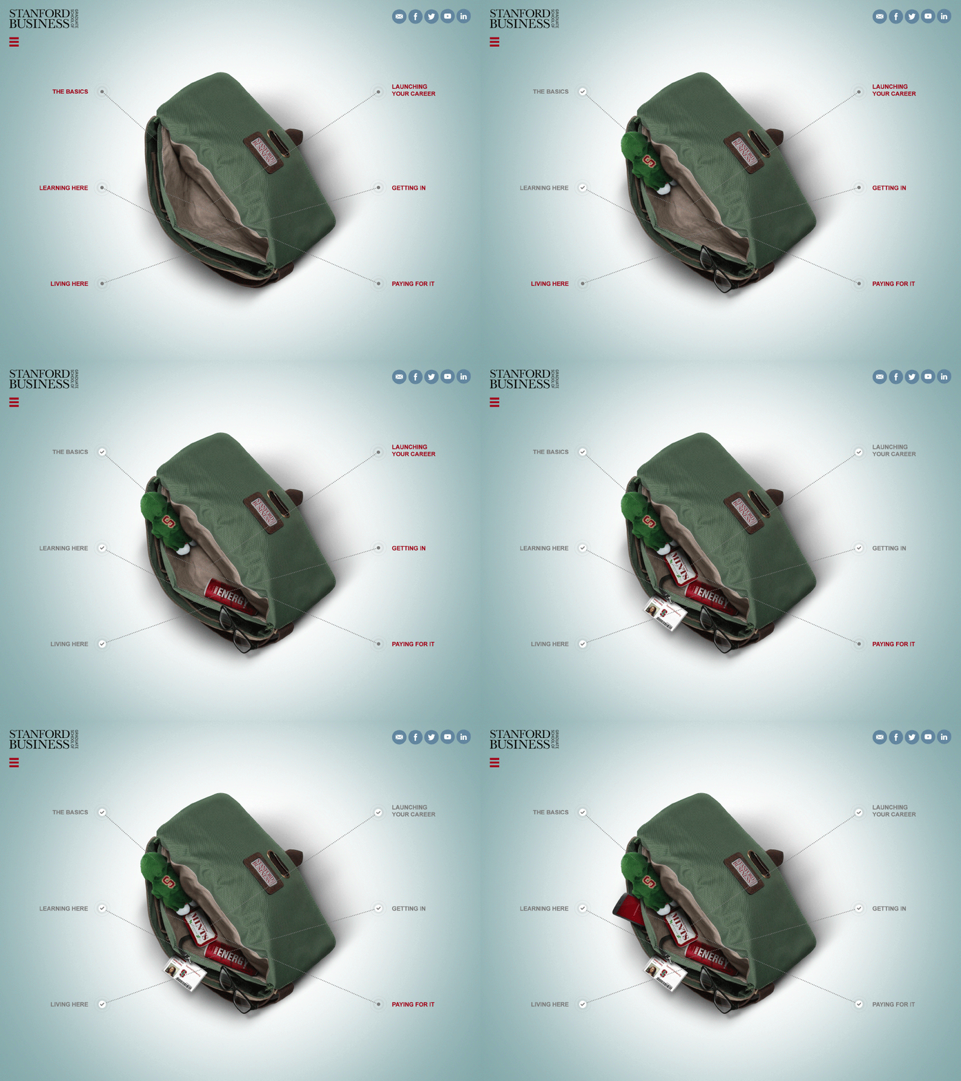
We chose to take a relatable student activity (packing your bag for campus) and used it to game-ify the process of researching the program. As prospective students explored the site to learn more about Moss and life on campus, they would “earn” objects to put in their bag (an energy drink representative of hectic on-campus living, glasses, representative of the education). The content wasn’t just interactive, it was actually engaging, which meant prospective students spent an average of 50% longer on this site than they did on the old one.
My role:
Concept
Visual Style (setting look and feel)
Wireframes
Production


